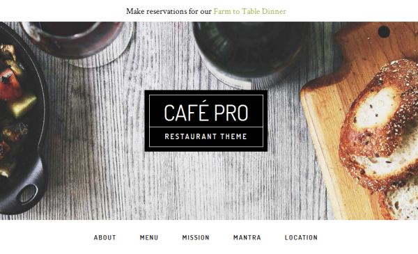
The Cafe Pro child theme for the Genesis Framework from Studiopress has among other features a sticky primary navigation.
It only becomes sticky when you scroll down past its location on the website.
The secondary navigation is positioned above of the header image, the primary navigation is positioned below.

The question was asked on the Studiopress forum, how the secondary navigation could be made sticky, too.
Let’s take a look at how Cafe Pro creates the sticky primary navigation.
Cafe Pro uses JavaScript in the file global.js to add a CSS class to the primary navigation when scrolling down beyond a certain point and to remove it again when scrolling up past that point.
In the style sheet this class is used to change the position attribute of the primary navigation to fixed (and to add some other things to make it look good).
We can use that information to make the secondary navigation sticky.
We can add the same CSS class to the secondary navigation with JavaScript and add and adjust a few CSS selectors in the style.css
The JavaScript file is located in \js\global.js.
Around line 40 change the code to look like this:
    if ($(document).scrollTop() > abovenavHeight){

            $('.nav-primary').addClass('fixed');
            $('.nav-secondary').addClass('fixed');

        } else {

            $('.nav-primary').removeClass('fixed');
            $('.nav-secondary').removeClass('fixed');
        }
Save the changes.
At this point, you will not see any changes on the website because the class .nav-secondary.sticky is not yet defined in style.css.
Around line 1216 of style.css find the following code
.admin-bar .nav-primary.fixed {
    top: 32px;
}

.nav-primary.fixed {
    position: fixed;
    top: 0;
}
Change it to
.admin-bar .nav-secondary.fixed {
    top: 32px;
}

.nav-primary.fixed {
    position: fixed;
    top: 100px;
}

/* Adjusting the top margin for Firefox */
@-moz-document url-prefix() {
.nav-primary.fixed {
    position: fixed;
    top: 70px;
    }
}

/* Adjusting the top margin for Microsoft IE10+ and Edge */
_:-ms-lang(x), .nav-primary.fixed {
 position: fixed;
 top: 70px;
}

.nav-secondary.fixed {
    position: fixed;
    margin: 0 auto;
    width: 100%;
    z-index: 999;
}
Remember to save the changes.
Refresh your browser.
This is what the result should look like:


Thanks! This was a great help. The only problem I’ve run into is that the primary menu disappears when the browser width gets narrower. — Not narrow enough to be the hamburger menus, but somewhere around 1,200 pixels wide
Setting the z-index of the .nav-secondary.fixed to 1 did the trick…
I do wind up with a small gap between the hamburger menus, of about 12 pixels, but I am working on fixing that.
Thanks again!
Hi Brian,
you are welcome.
Thanks for using the tutorial and providing valuable feedback.
I was not able to reproduce that the primary navigation disappears.
I will add a note and your solution to the post.
For the hamburger menus, around line 1282 in the theme’s style.css — Change the padding to 15px and it fixes the issue.
Here’s the relevant section…
responsive-menu-icon::before {
color: #000;
content: “\f333”;
display: block;
font: normal 24px/1 ‘dashicons’;
margin: 0 auto;
padding: 15px;
text-align: center;
}
Thanks, Brian.
I was focused on getting the desktop version working.
There are a few things I have to add to the code snippet for the mobile menus.
I appreciate that you are sharing your code.
I am happy you got it working.
Christoph
Your tutorial was a great help! I really appreciate it. The Firefox and IE changes fixed my original scrolling issue, which was in Firefox.
I’m happy to hear that.